Naked Notion
Brand Identity & Marketing Collateral
The Challenge
Shelby had already built something special. She knew how she wanted clients to feel when they walked through the door, but translating those emotions into a cohesive visual identity proved difficult.
The goal wasn't simply to design a logo. It was to create a brand that felt as restorative and intentional as the experience she provides.
The Strategy
Through my brand strategy process, we explored what inspired Shelby, how she approaches skincare, and what keeps clients coming back. One idea surfaced again and again: nature. Shelby spoke about the way being outside calms her nervous system. The quiet. The balance. The feeling of returning to herself.
That became the foundation for everything that followed.
Creative Direction
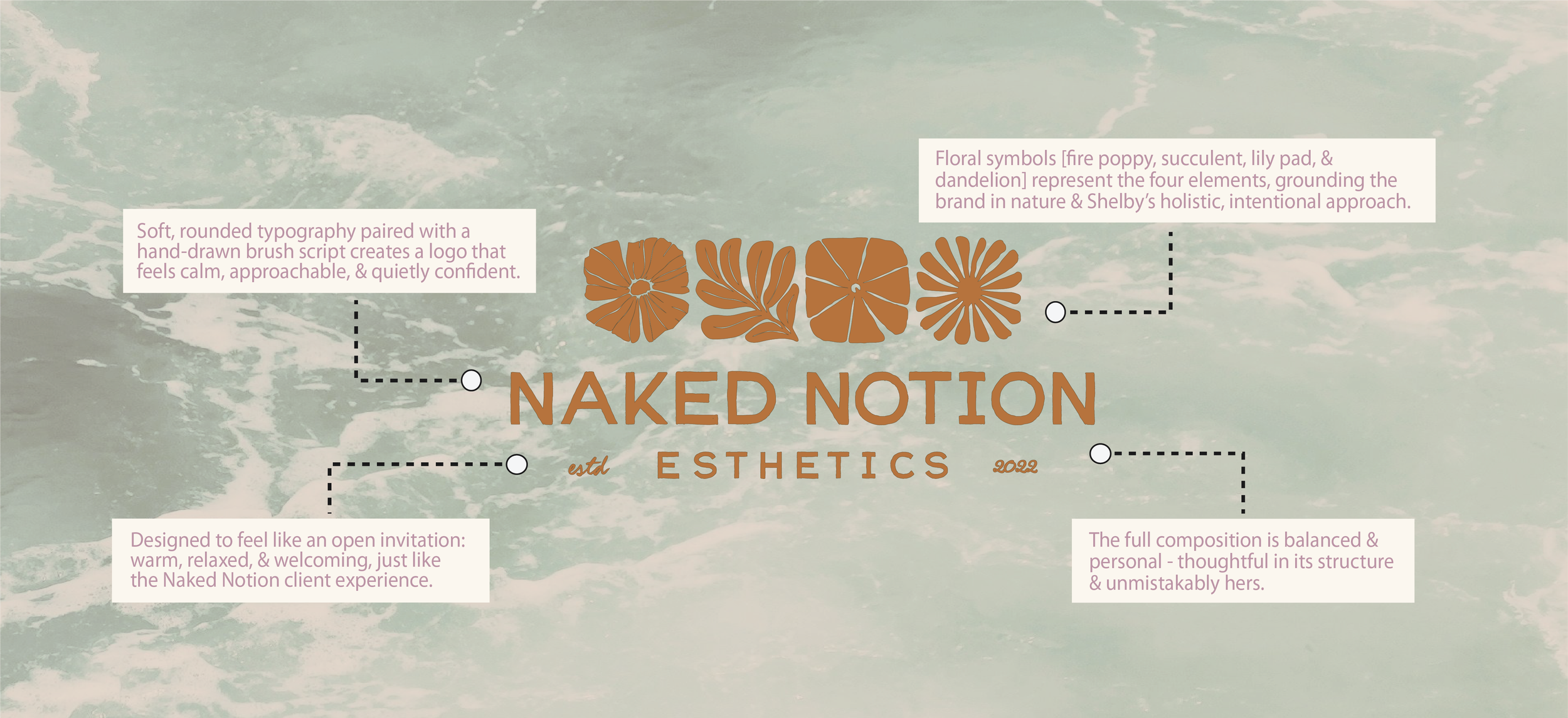
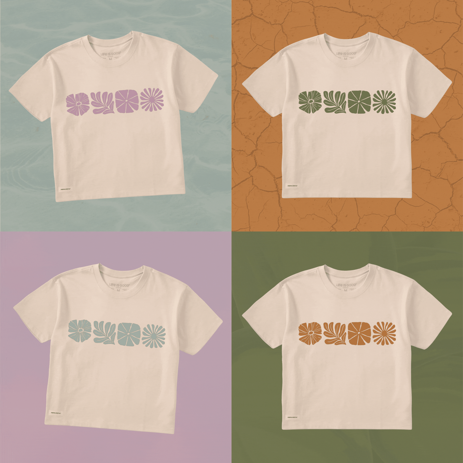
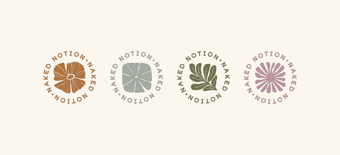
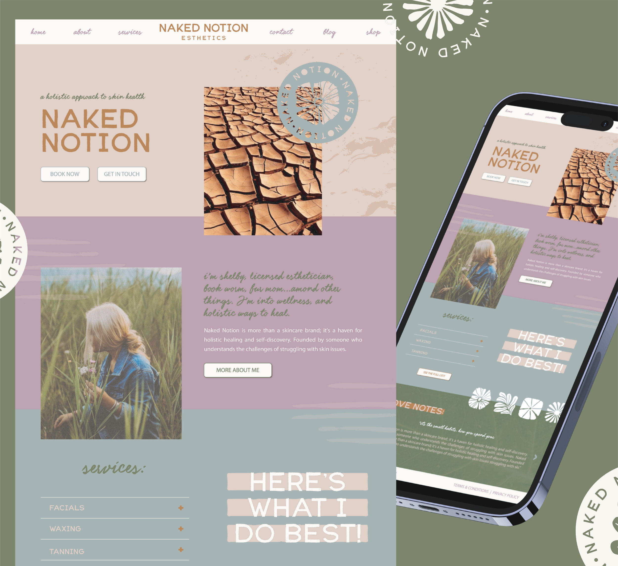
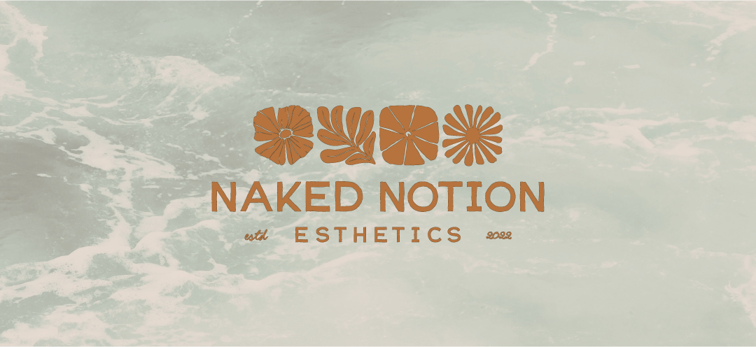
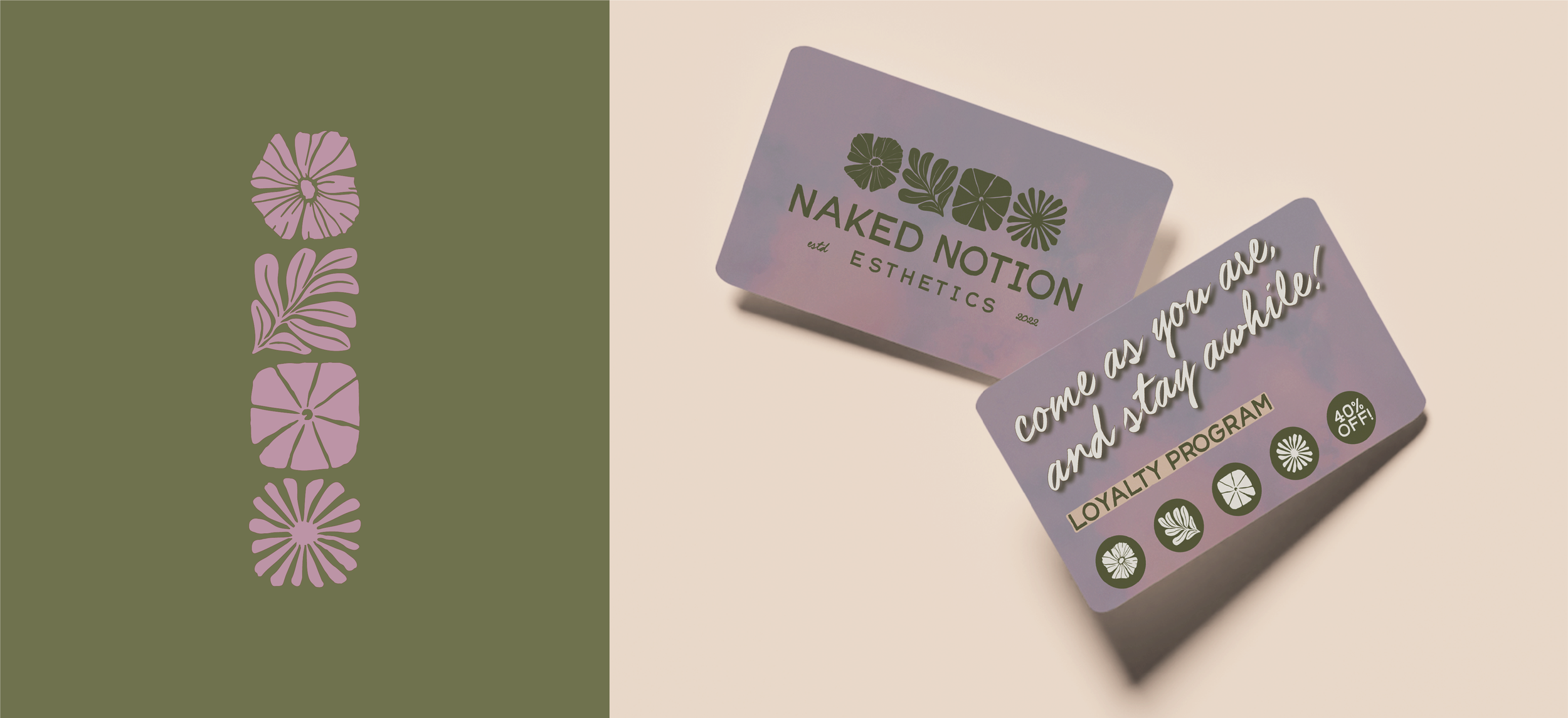
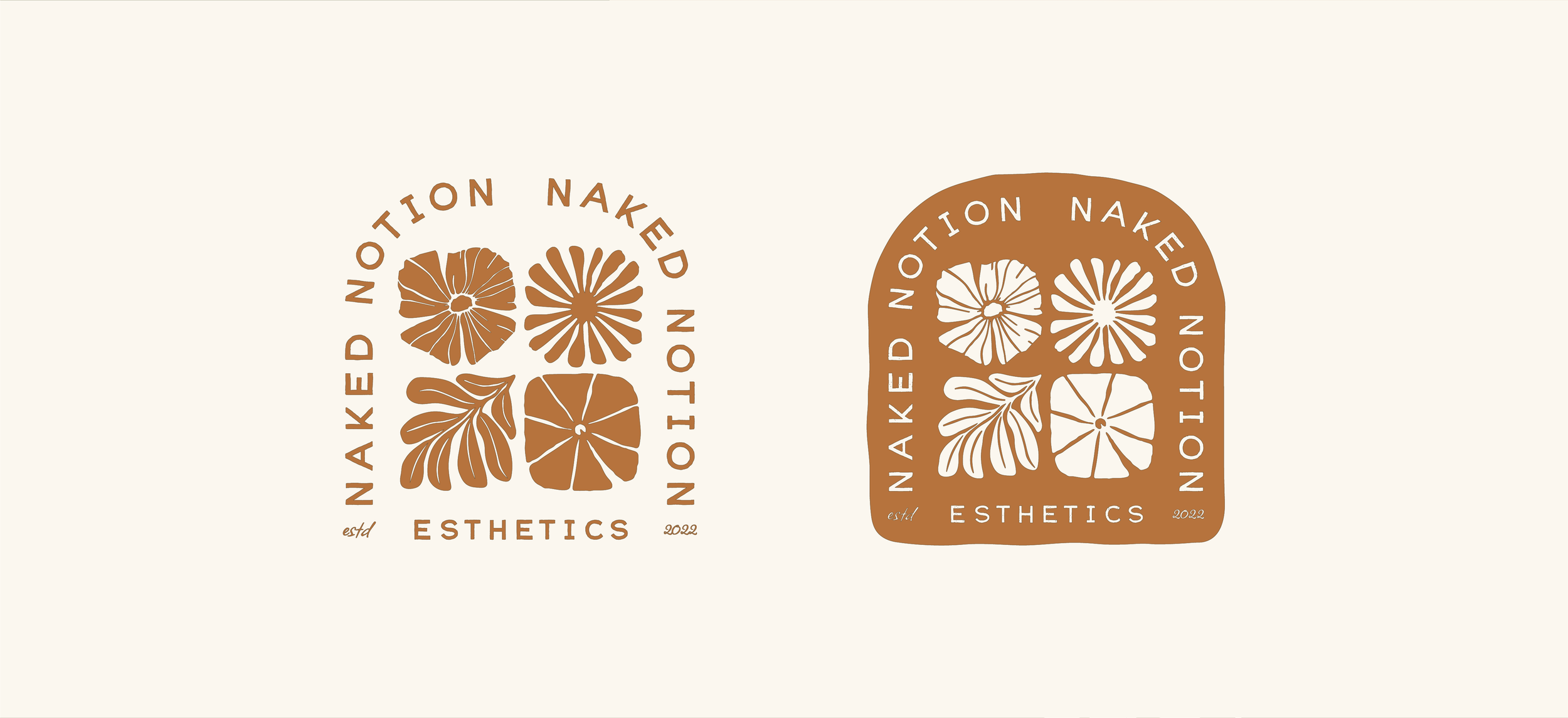
Rather than creating another minimalist esthetics brand, we built a visual identity around the four elements—Earth, Water, Fire, and Air. Each represents a different aspect of restoration while reinforcing Shelby's holistic approach to skincare.
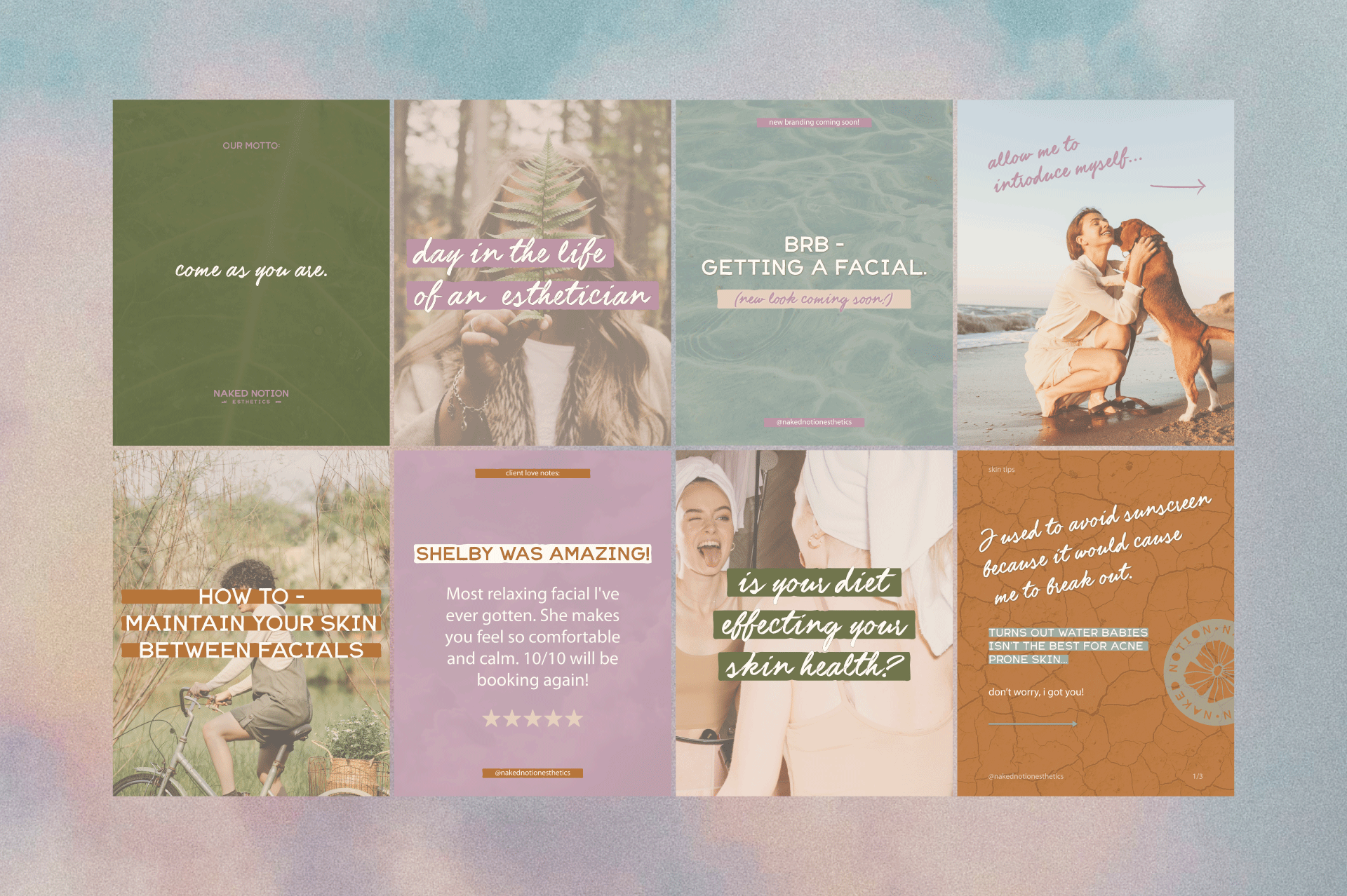
Every design decision serves the larger story. From the rounded typography to the hand-drawn botanicals, each element was intentionally chosen to reinforce the feeling Shelby wanted clients to experience.
The Outcome
A thoughtful brand doesn't just look better—it makes running a business easier.
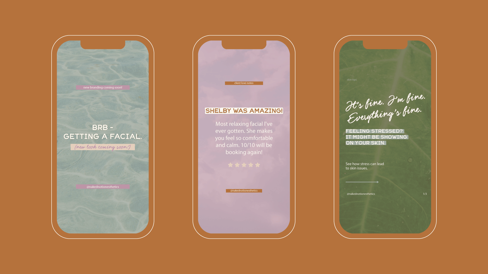
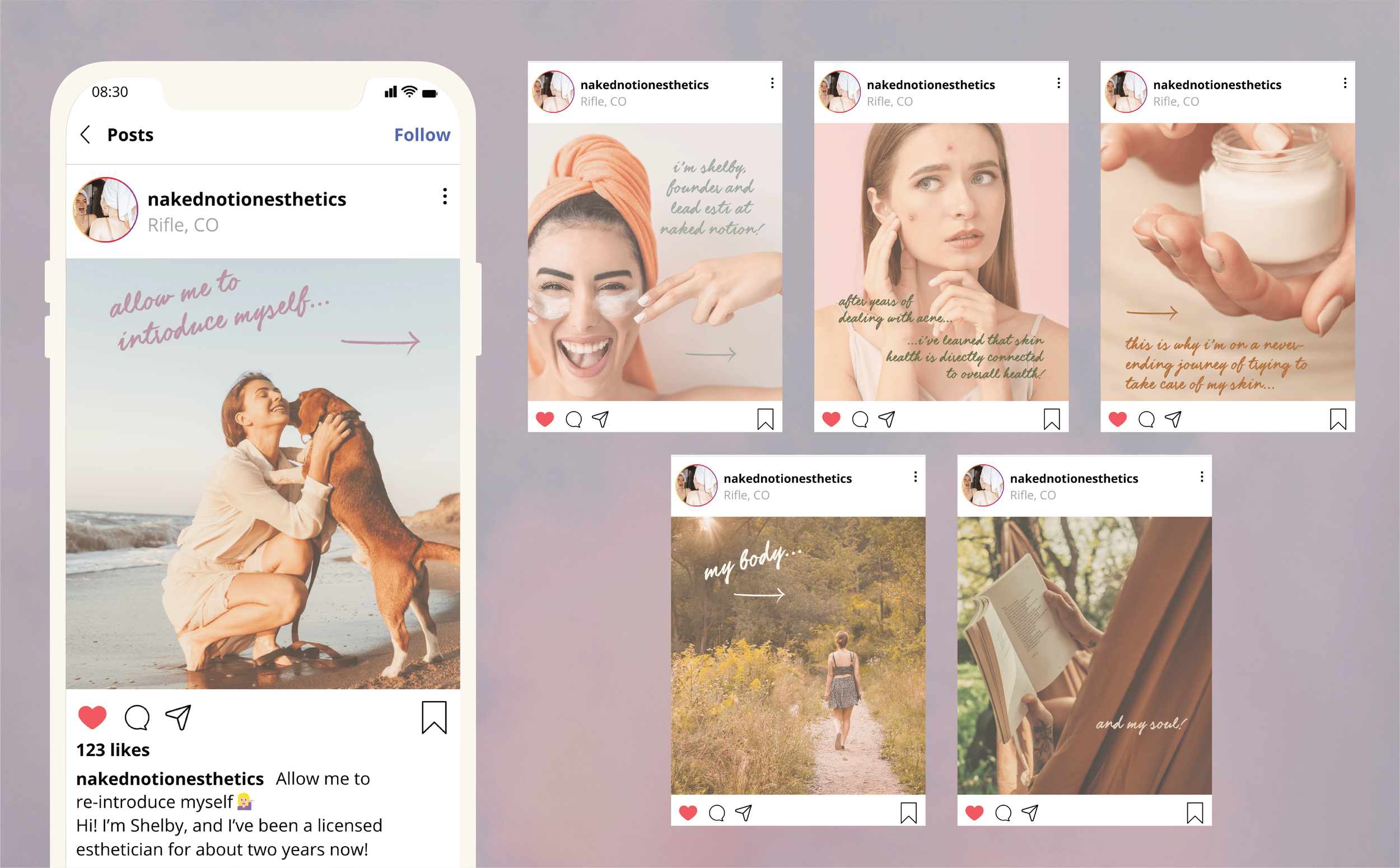
Through strategy, Naked Notion gained a clear direction that now guides every design and marketing decision. Shelby has the confidence to show up consistently, communicate her value with clarity, and create a client experience that feels cohesive from the first impression to the final appointment.
The rebrand has helped strengthen brand recognition, attract new clients, and provide a solid foundation for future growth.